User Experience Design
Designing intuitive user experiences for a social e-learning platform in Copenhagen

Designing intuitive user experiences for a social e-learning platform in Copenhagen
I joined the FullBrain team with in October of 2021. As a student myself, I was driven to be a part of this company; together, we’re working toward building a collaborative future for digital learning that inspires a sense of community between students.
I’ve spent the last few weeks working to design intuitive user experiences, build cohesive user maps, and practice design thinking with my brilliant service-designer teammate Laura.
When Laura and I sat down a few weeks ago with our preliminary customer journey maps, we tried to pinpoint user experiences goals that we could focus on in the coming months. But we ran into roadblocks pretty much right away—there are current UX elements that seem to be built for a certain user that contradict other site elements later on. In short, there is the FullBrain that is built for social students who just want to pass a class, the FullBrain designed for students who want to broaden their learning scope, and the FullBrian built for students looking for a gamified learning experience. In other words, FullBrain is having an identity crisis.
Before we even set on defining UX goals, we looked to strengthen the FullBrain system and understand its purpose from the inside out.
After mapping out our thoughts on pen and paper, I made this site map in Figma to help ground our process—this helped me visualize all of FullBrain’s services in one place. I broke down our take-aways into sections, color coded and classified here as the onboarding process (in pink), the home page (blue), the gamification path (purple), the posting sequence (orange), and the course/concept hub (red).
The home page gets to the heart of the FullBrain identity crisis. Following the onboarding process that revolves around specific universities, users are expecting a university-central experience.
However, the home page of FullBrain tells a different story.

So let’s get some quick context—we’re looking at the section in purple on the site map. This live feed—made up of updates from courses, concepts, and people you follow—owns the most powerful piece of real estate in the entire site.
Given its significance, I wanted to really consider the story its trying to tell.
Here, universities are not prominently displayed, and instead the user can interact with concepts—an idea that is not explained or mentioned anywhere else on the site—and follow people from other universities. This kind of narrative suggests that FullBrain is greater than the university network—that it is meant to connect people based on concepts; that students are learning to grow their network and cultivate a community. I call this kind of FullBrain experience the “learning for the sake of learning” story.
Furthermore, moving to users profile on the recommended list to the right of the home page, we can see that on people’s profile, their posts & sources, courses, and concepts are displayed. Again, concepts are pronounced in the visual hierarchy of the page—it feels important that people are grasping concepts beyond their courses; rather, people are taking classes because they are rooted in the greater context of concepts, and these concepts facilitate a global learning community that transcends individual universities and courses.

Redirecting the conversation to FullBrain’s identity, we looked to the story that this site map is telling us. There is the FullBrain identity that is inward— roadmap, values, mission, vision—and the FullBrain that is outward—who is our persona, how can we best address them, how can we identify the core constituencies. The latter is what we’re interested in addressing going forward. Looking at our site map, we saw that we were appealing to different users with different goals—the “identity” of FullBrain—how students feel when they use the site—is fractured, with varying purposes and directives.
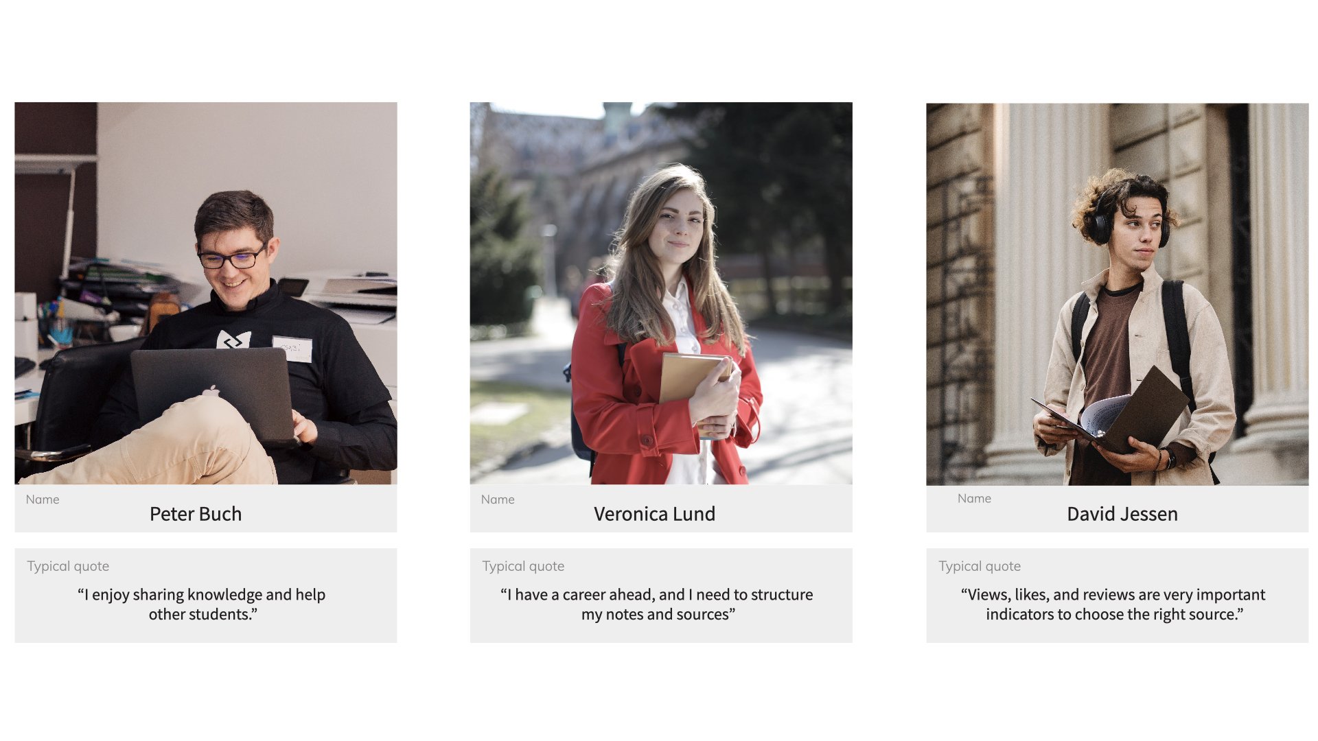
And we know what our students want.
A recent typeform survey tells us:

So let’s read between the lines here—there is the FullBrain that is social media, there is the FullBrain that is the learning platform, there is the FullBrain that is based on rewards and points. Essentially what students are saying, is that we are supporting all three of these services, but we are not doing any single one of them extraordinarily well. In fact, we are diluting FullBrains identity by appealing to these three versions. We need to focus our resources on building up one of these services going forward.
Lack of engagement
Too many calls to action when creating a post
Tedious process of metadata registration


Efficiency: users want a more intuitive workflow
Simplicity: users find value in integrating the functionality of adding a “post” and a “source”
Alignment: aligning users’ perspectives with our business goals.
“A Design System is the single source of truth which groups all the elements that will allow the teams to design, realize and develop a product. A Design System is not a deliverable, but a set of deliverables. It will evolve constantly with the product, the tools and the new technologies.”

We pushed our design system assets live for our initial prototype iteration, completed in December of 2021 for our first round of A/B testing.
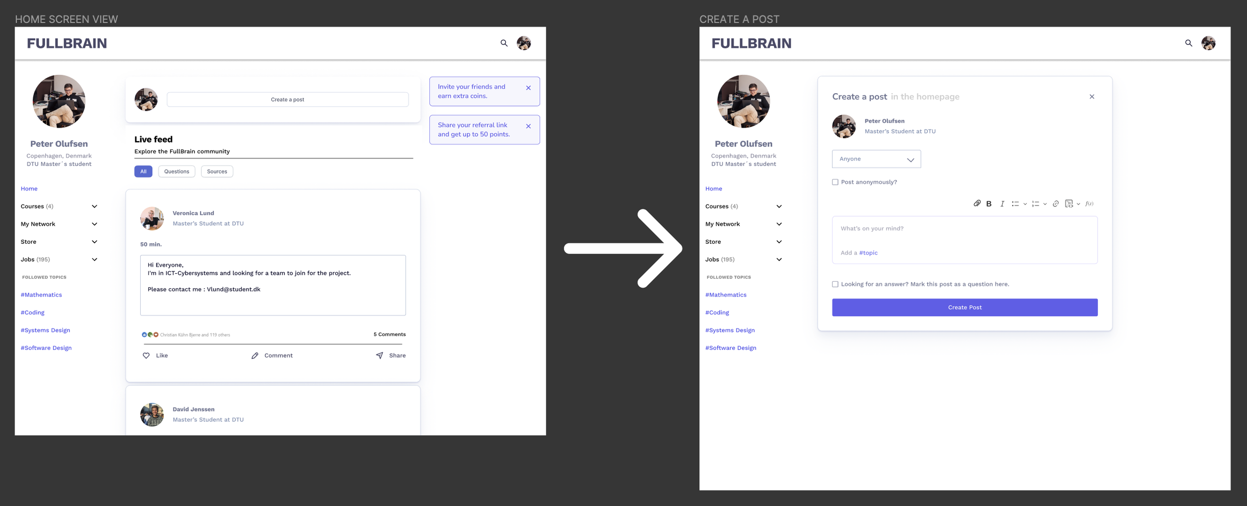
We prioritized the home screen feed and “share a post” user flow: this was the keystone of Fullbrain’s product and the most important user action.

We added gamified points throughout the flow to boost user engagment.

Our adjustments to the home page correspond with 5 key ideas:
Navigation: we organized the user’s menu with intuitive categories, including hashtags corresponding to certain topics or courses.
Helpful indicators: users indicate that time affects whether they engage with other students. Adding how much time is needed to support another user helps to mitigate confusion and support user’s expectations.
Brevity and clarity: a short message above helps to separate the user’s text from the attached source.
Categorization: separating relevant data from attached documents supports other users in creating and tracking their sources.
Rating: users indicate that they want a way to measure the relevance of sources. Star ratings (out of 5) makes it easy for users to judge source material at a glance.
Here’s what we might do: Align our design system with the graphic design team. Perfect the source metadata inputting flow. Create a usage guide for the topic/hashtag concept. Spend adequate time on each feature we adapted; expand our user testing to include every product change.
