Buzz
Design Thinking & Value Proposition application.
Design Thinking & Value Proposition application.
my team decided to address a pain point that all study abroad students feel—the headache of travel logistics. We settled on a mobile application concept that makes life easier for students by streamlining the travel planning phase, centralizing document storage, and connecting travelers with students in new cities. To answer potential student needs, my team applied the design thinking process — we worked with value propositions, information architecture, user research, online interface design applications, and customer journey mapping, and practiced user-centered design throughout each phase.
My team and I were given four months to design a solution for study abroad students — it was up to us to define pain points, opportunities for innovation, and conduct user research within the context of digital design, but before we began our project we had to define the design thinking process: what does it require, who is it for, and how can we apply it most effectively in the next four months?
Design thinking is an innovative strategy for problem solving that is driven by the user's experience. It can be used for any problem, but is most effective in solving complex issues involving vast amounts of people and industries. The design thinking process integrates product efficiency, creativity, and empathy to address latent consumer needs, and is especially constructive when teams synthesize industry intuition and analytical thinking. We made this infographic to keep our team on track:

Following the design thinking strategy, my team started our project with the empathy phase— from the beginning we knew we wanted to make a product that would address stress associated with students who travel, so we set out to empathize with our peers and define common pain points. We used all four methods of empathy: interviews, surveys, cultural probes, and observations.
Each team member interviewed one adult who has studied abroad, and two students from separate study-abroad programs. We practiced curious, wholehearted listening and did our best to be comfortable with silence, always ask “why”, and take diligent notes. Our leading questions were:
How do you organize your trips?
How do you keep track of documents?
What is your least favorite part of traveling?
After asking the questions above, we received answers that revealed that logistical organization is a consistent pain point, including:
"My least favorite part of traveling is dealing with logistics."
"I usually just keep my information on my phone, but it's not organized."
"I wish I had a way to keep track of all my plans."
Ultimately our studies revealed that many students wanted to be more organized, but they didn’t have a convenient, easy way of doing it.
With that in mind, we sent out a short survey to a study-abroad program and received 71 responses in return. The survey revealed that organization is an issue for the greater student body, with more than half of answers confirming that organizing trip details (Itinerary, housing, budgeting) is an issue for them or the group that they are traveling with.
We synthesized our observations, cultural probes, surveys, and interviews to further empathize with students and organize their frustrations into a primary pain point:
Students want to travel with friends, but it is difficult to organize and communicate clear plans to a group.
We started the empathy phase by only targeting students studying abroad, but our findings revealed that the pain points that we were addressing were more ubiquitous. Thus, we revised our users to include all college students between 18-24 who are interested in traveling. After we finalized the empathy phase, we took to the white boards to craft an empathy map. This helped us differentiate what our users were saying, doing, thinking, and feeling. With this information we could clearly define our users and their pain points:

The empathy phase also prompted us to refine our “how might we” statement: before our research, we tentatively sought to “travel hassle free while keeping track of memories, logistics, and budget”.
After processing our data, we realized that managing budgets, memories, and logistics was important, but that convenience was the source of the pain point. College students already have little time and energy to spare, so we must find a way to consolidate our features and make it convenient to use.
Our “how might we” statement is our problem statement that will guide us through the rest of the process. It identifies the aspirational state of the project in clear, tangible language. Our new statement is:
“How might we travel hassle free while conveniently keeping track of memories, logistics, and budget?”
After defining our users and problem statement, we moved to refine our descriptions and coincide pain points with proposed solutions. We utilized the Value Proposition Map from Value Proposition Design by Alexander Osterwalder to map out our ideas. On the left, the product profile displays our features in more detail and breaks down our value proposition “into products and services, pain relievers, and gain creators.” On the right, the customer profile describes “a specific customer segment in your business model in a more structured and detailed way. It breaks the customer down into jobs, pains, and gains.”

For our ideation phase, we turned to the whiteboards and sticky notes to connect our value proposition and problem statement to a tangible idea. The ideation phase combines divergent and convergent thinking to define a creative, unique, determined product.

We recruited guests to help brainstorm solutions to our problem statement. We had two sessions, each timed at 20 minutes, to ideate with guests— the first session was spent on more open-ended travel frustrations, the second session was more focused on our problem statement. We found that the second session was much more productive; we learned that students are most interested in a clear, straightforward application that eases the strain of traveling with groups to new cities.
We also finalized our value proposition statement during this time:
My team and I decided to make a high-fidelity prototype in Figma, allowing us to focus on our information architecture, branding, and functionality. Our prototype is made up of 21 screens that tracks the experience of our user “Sarah”, a Junior at the University of Michigan Business School hoping to go to Madrid for spring break. Sarah uses Buzz to make group itineraries, participate in the open forum to accrue buzz points, and keep track of her budget and reservations.
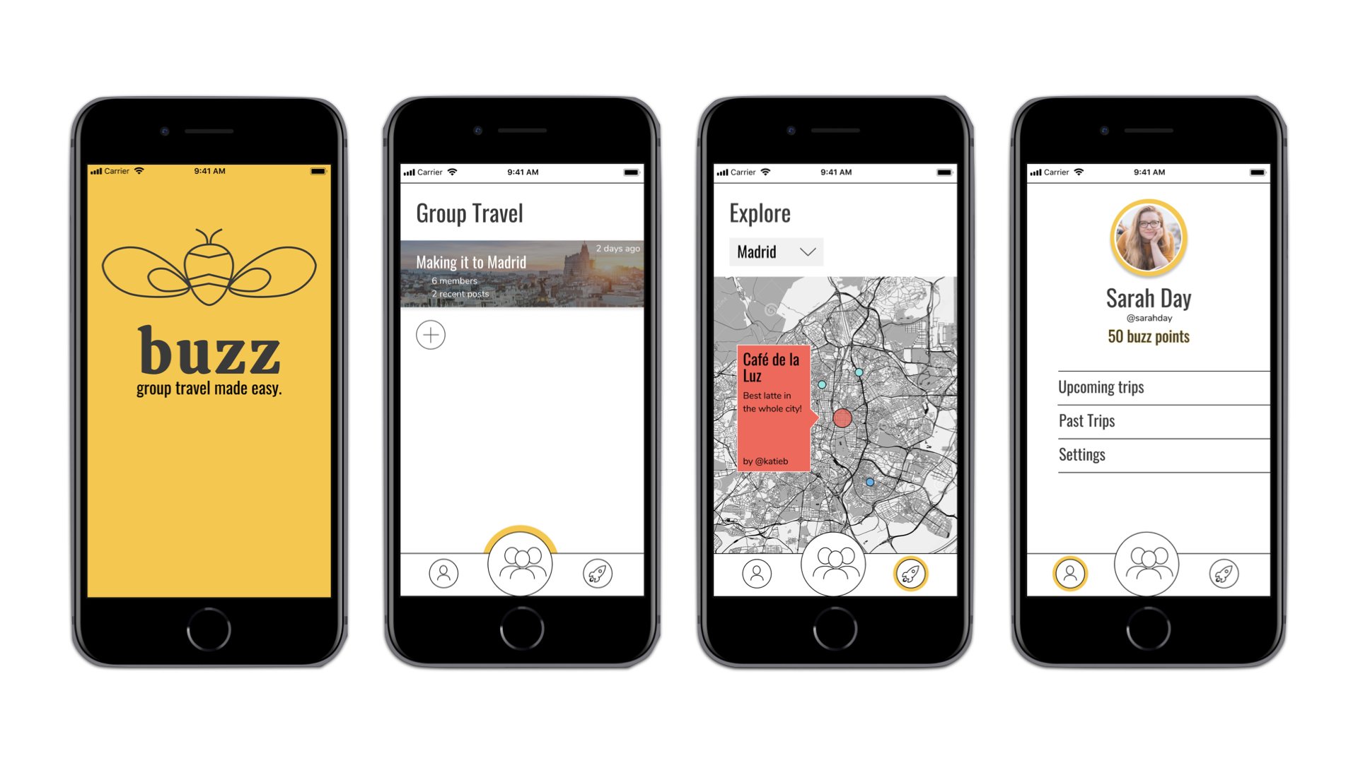
The functional framework of our app is made up of group itineraries, Venmo integration, and a real time message board with travel tips and reviews from friends, influencers, and the buzz community. However, Buzz goes one step further by “gamifying” the idea of Buzz Points (accrued by commenting on the public forum). This metric helps to connect the community, provide incentive for engagement, and supply emotional investment. The app ultimately relies on user engagement; without engagement, the app fails to relate users and provide an active open forum. Thus, the “secret sauce” of our application is the emotional gratification that comes from relying, connecting, and helping a community of like-minded students. For this reason, using Buzz is not just about keeping logistics organized and groups connected, it is also about doing good.
The functional framework of our app is made up of group itineraries, Venmo integration, and a real time message board with travel tips and reviews from friends, influencers, and the buzz community. However, Buzz goes one step further by “gamifying” the idea of Buzz Points (accrued by commenting on the public forum). This metric helps to connect the community, provide incentive for engagement, and supply emotional investment. The app ultimately relies on user engagement; without engagement, the app fails to relate users and provide an active open forum. Thus, the “secret sauce” of our application is the emotional gratification that comes from relying, connecting, and helping a community of like-minded students. For this reason, using Buzz is not just about keeping logistics organized and groups connected, it is also about doing good.

For the final presentation of our product, we decided to make a video commercial with a sparkline narrative. This generated a fresh storyline to follow our value statement, and followed a call to action that was clear, specific, and is intended to appeal to student travelers. Going in, we defined the purpose of the video as a way to build understanding of Buzz and inspire engagement. The purpose of this video is to illustrate the emotional value in using Buzz; Sarah can use the app to unlock a fresh travel experience, distinct for the organized logistics, meaningful connection, and sense of authentic community.

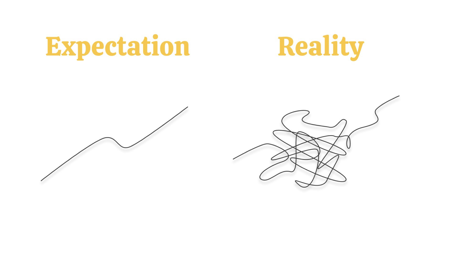
This project turned out to be both the most frustrating and gratifying venture I have ever committed myself too— it forced me out of my comfort zone, drove me to work harder, and asked me to do more than was asked. I expected my process to be straightforward, but there were many unforeseen complications— compromise, failure, and effort are all integral ingredients to the project that just recently became Buzz. I have a passion for design thinking, user experience, and graphic design, and this project impelled me to give it all I had.
